 |  |
| One of the most important parts of game development is graphic design. How can you have a game without graphics? So some game developers hire an artist to draw the graphics for their games. But some of us are the do-it-yourself type. I'm part of the latter group as I like to draw my own graphics, make my own music, and write my own code. So... say you have just downloaded the popular graphics software, GIMP. Perhaps you only want to draw something simple like a baseball or something. Shouldn't be too hard, right? Well, like most advanced software, it's easy to get lost in the endless menu and options of GIMP! And the help page is so long... where to start? So, lo and behold, here is this article which will list ten tips and tricks which will help you get started! |
1: Setting Up The Interface |
|
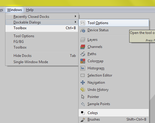
Highlighted: the three dialogue boxes that you're probably going to need.
2: Layers & Navigation |
|
3: Select... Then Draw |
| There should be about eight selection tools at the top of your toolbox, and more selection options under the select menu dropdown. I'm not going to thoroughly explain all of them, but the first five (rectangle, ellipse, free select, fuzzy select, and select by color) are all pretty straightforward and you shouldn't have any trouble using them. Anyway, one major rule I try to stick to is "Select, then draw". Always make a selection in the shape you want to draw, then fill it in and shade it and stuff. 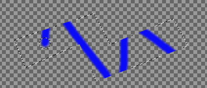 Select, then draw. So why is it that I have this rule? Well, selecting the shape that you want to draw makes drawing it and shading it soooo much easier! As a result the end result tends to look much prettier too. Here's an example of two spheres I drew. The first was made simply by drawing a circle with the paintbrush (well at least it's mostly circular) and by attempting to shade the borderless object, with a few effects applied. The second was made by creating a circular selection (ellipse select, hold shift) and drawing and shading a ball inside the circle. 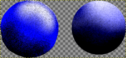 Since I can read your mind, I know that you like the second sphere better. |
4: Always Save Your Progress |
| Okay this one's a no-brainer. Like why am I even mentioning it? Like everybody knows, "Always save your work, because if something happens, you don't want to lose it." Well some people seem to respond to that question with "Duh, I'm not going to accidentally click the X button and then accidentally click the don't save button!!!" I can even remember a few times where I followed that same train of thought, and ended up losing my GIMP work. The real reason you're going to want to save your work a lot with GIMP is because accidentally clicking the X button is not the only way to lose your work with it. GIMP is a great program, but it's not perfect, and occasionally it will crash. It has a lot of plugins, and a few glitches, so occasionally you'll do something and suddenly all twenty-nine unsaved GIMP tabs will spiral into an epic ball of flames. So save your work periodically. Or else. :P jk Also, needless to say, saving multiple versions of GIMP drawings along the way is always helpful so that if absolutely necessary, you can go back to older versions to perhaps retrieve a layer without an effect you applied later or something like that. |
5: Adding Depth |
| Unless you want flat design for everything you draw, you're going to want to add depth to your drawings. And even with flat design or other related styles, a little bit of depth couldn't hurt! Luckily, GIMP has tons of tools for adding depth to your image! From tools>transform tools>perspective to filters>map>bump map and even maybe filters>blur>motion blur, you can practically turn a 2D image into a 3D one with little-to-no-effort! Despite the little-to-no-effort thing, my favorite way to add depth to an image is manually doing it with the airbrush. Similar to the default paintbrush, the airbrush is basically the more transparent version, and the longer you hold your left mouse button down the more opaque the area you're holding it over gets. To slow down its effect you can change the opacity (or rate) setting in the tool options dialogue. Anyway, the airbrush is pretty cool for shading because you only have to draw with the color of the light you want shining on your object. For example, say you were drawing a green object with a red button on it, and you wanted to lighten the top of it so that it would appear as if it was under a spotlight. If you were to use the paintbrush, you'd likely have to find a lighter shade of green and a lighter shade of red, and shade the top of the green object the lighter green and shade the top of the red button a lighter red. This is fine, but it would just be easier to use the airbrush. Why? Well with the airbrush you could just use a pure white and brush over the top of the green object and the top of the red button. Much easier. Another of my favorite ways to add depth to a GIMP image is using filters>light and shadow>drop shadow. It's especially good used for emphasizing text. Drop shadow works by taking the outline of the currently selected layer, and filling it with a solid color with a set opacity. Then it blurs that color by a certain number, and puts the finished shadow right behind the selected layer. The settings for this effect are pretty straight forward and you should have no problems using it. Anyway, as a demonstration, I drew two buttons. The first has no depth and in my opinion is pretty boring. The second, however, has been shaded with a black airbrush on the bottom and left side and with a white airbrush on the top and right side. The text also has a drop shadow applied to it. 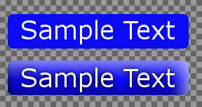 Remember, I can read your mind, so I know that you like the second button more. |
6: Panning & Scrolling |
| Often comes a time when you'll find yourself drawing either an extremely large or very wide image. When this happens you might find yourself slightly annoyed at the dockable dialogues I had to put to the left and right sides of your screen. Often those dialogues will be covering part of the image, and it gets awfully annoying to move them around all of the time. And GIMP doesn't let you scroll past the edge of the image with the scroll bars. Luckily, there is a solution or two. The first one is a little bit imperfect, but it works. Put the main GIMP window into windowed mode, then reduce the width of the GIMP window so that neither the toolbox, the color palette, nor the tool settings dialogue is covering it at all. That way when you scroll to the edge of your image, it's not covered by a dialogue. The second solution is a cool trick I noticed a while back. You can use it if you have a three button mouse, as GIMP allows you to pan by clicking and holding your scroll wheel and dragging. This solution is almost perfect, but beware... for some reason, if you pan for an extended amount of time, GIMP might start to freeze up or run slowly. But for quickly moving the edge of the image out of the way of a dialogue box, the scroll wheel works fine. |
7: Fuzzy Select & Color To Alpha |
| I have a certain hypothetical. Suppose you drew an orange sphere on a blue background, but since nobody listens to me when I say that everything should be on its own layer, you drew it all on a single layer. :P So suppose you wanted the orange sphere all by itself suddenly. How would you remove the blue background from the orange sphere? 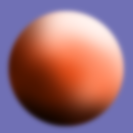 Orange shaded sphere on blue background. All one layer, which complicates background removal. Well, luckily, since the blue is a single shade, you can use a special GIMP tool for this. Lo and behold, Color To Alpha! You can get at the effect by colors>color to alpha or layers>transparency>color to alpha. If the option is grayed out you first need to add an alpha channel by layers>transparency>add alpha channel. What color to alpha does is it turns all pixels of a specific color into transparency. Additionally, it will subtract that color from all other pixels on the screen. So if you have a purple background, and use color to alpha on blue, you'll end up with a pink background. This is a really helpful feature, but it also means that you can't use color to alpha right away to remove that blue background. If you do, you'll end up with something like this: 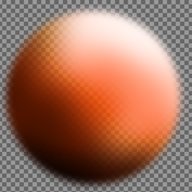 Orange sphere with color to alpha on #7070b5. So to fix this, it's time to use fuzzy select! Fuzzy select will select neighboring pixels of similar color, within a threshold. To select more, increase the threshold variable in the tool options dialogue when the fuzzy select tool is selected. In this case you'd want to choose a threshold high enough that when you select the blue pixels, the selection is just inside the gradient edge of the orange sphere. The selection would look something like this: 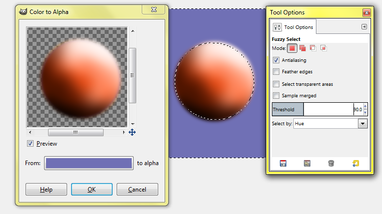 For this image I had the most luck with fuzzy select by hue at threshold of 90. |
8: Transform To Win |
| There are two transform tools that you might just find yourself using a lot in the future. The first one I've mentioned before, it's the perspective transform tool, and it's really helpful. And epic. For example, see the code image I used for this website's background? Notice how the numbers are closer to you on the bottom-right side of the screen and further away and smaller close to the top left corner? Much more interesting than a flat screen of numbers, right? And yeah, that was done with the perspective tool. Using it is pretty simple. Select the perspective tool by tools>transform tools>perspective or by clicking the perspective tool in the toolbox. It icon for it looks like a square being turned into a trapezoid. Using it is pretty simple. Select the layer (or selection) you want to transform, and drag the corners into the quadrilateral you want. You can also move the center of the transformation matrix to move the image at the same time. 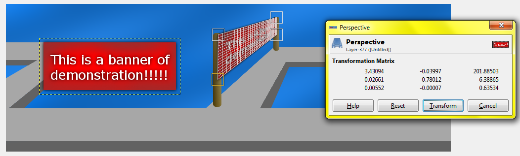 Transforming a banner to make it look 3D. The second tool you'll probably use a lot is the move transform tool, which you can find at tools>transform tools>move, or in the toolbox. You can also find it in the toolbox, it's the four way directional arrows. Anyway, the fact that you're going to need this tool a lot is to be expected though, why wouldn't you need the move tool? Well, it almost does what you might expect... it can move around layers and selections. But if you select a rectangle portion of a layer, and then try to move it, you'll find that you can only either move the layer, or the actual selection itself. Not the selected part of the layer. Why is this? I don't know. But there is an easy-ish slightly annoying work-around. Even so, this is another example as to why you should keep separate elements of your picture on separate layers. So suppose you have two green squares on the same layer separated by a thin line of transparency, and you wanted to join them together to make a green rectangle. Well, since moving one rectangle moves the other one too, you'll have to select one of them with the rectangle select tool. After that, press Ctrl-X, then Ctrl-V. Now you can move it around separately with the move tool. Once you're ready to merge it back with the other layer, you can click just outside of its boundary, or you can turn it into a new layer by layer>to new layer. |
9: Texturing & Instant Texturing |
| Textures can make all the difference. Take a look around you. Maybe pick up a cardboard box. Notice how it's not a single shade of color. Yet it's not like it's got this vibrant texture or anything, just a little bit of noise and stuff. There are graphic themes (especially in vector graphics) where the goal is to leave the shading and texturing to a minimum, such as the simplicity trend. So if you are aiming for realism, or simply want a bit of detail in your image, you're probably going to be happy when I tell you that GIMP is great for adding texture to an image. There are multiple ways to texture, and I'm sure there are probably ways I haven't discovered yet. But here are three ways, including three of my favorite effects. Before you start texturing, remember to select the area you want to texture first. Unless of course you want to apply the same texture to the entire image/layer without boundaries. The first way you can texture an image is definitely the most simple: using the paintbrush or airbrush. Right offhand you might wonder how you can texture an image with a circular brush. It is technically possible, although maybe a waste of time. Luckily there are more brush options, all you have to do really is click on the image of the current brush in the tool options dialogue and select one of the many other brush options. A lot of those brushes are great for texturing, play around with them, experiment, and see which ones you like. But that's not all! There's a special setting for the paintbrush and airbrush you might find handy. Click on the mode dropdown in the tool options dialogue, and select "dissolve". This mode basically turns your brush into a spray-paint can, or at least that's my interpretation of it. And while you're experimenting with dissolve mode, you might as well try some of the other modes too. When it comes to the paintbrush or the airbrush, experimentation can be very helpful and productive. The second way you can texture an image is by using the fill bucket. Now that doesn't sound very interesting! But if you select the fill bucket tool and look at the tool options dialogue, there's an option you might find useful: pattern fill. Select the pattern fill radio button, and you can now click on the pattern (default is pine, I think) and select one of many other patterns. This is a really cool effect to give text in my opinion, but you can use it for almost anything. Perhaps take a thick font like Antique Olive, write something with it, and fill all of the letters with your favorite pattern. While the pattern fill is pretty cool and useful, I say don't overuse it. Why? Well there are only so many patterns, if you use them too much then all of your drawings are going to look very similar to one another. But overall, pattern fill is good when you just need a quick texture for your image and don't want to spend all day doing it. The third way you can texture an image is simply by grabbing a texture off the internet, or perhaps making one yourself, and using that in your image. Make sure though that if you grab a texture off the internet that you have permissions to use it for what you want to do, though. My >>textures<< are completely free though if you ever want to use those. To texture an image with a texture sample, start by opening the sample in a new GIMP window. select>all then press Ctrl-C. Go back to the first GIMP window and press Ctrl-V, then layer>to new layer. You're also going to probably want to send the texture layer back a few layers so that you can see the object you're going to texture. Once you've finished selecting the part of the image you want to texture, press Pg Dn or layer>stack>select next layer until the texture sample is the active layer. Once it's the active layer, you can invert the selection via select>invert, crop to selection (layer>crop to selection), then press Ctrl-X. Finally, you can move the texture sample layer to right above the layer you're trying to texture, then press layer>merge down. If any of that sounded confusing, try going through it step by step and doing it yourself. 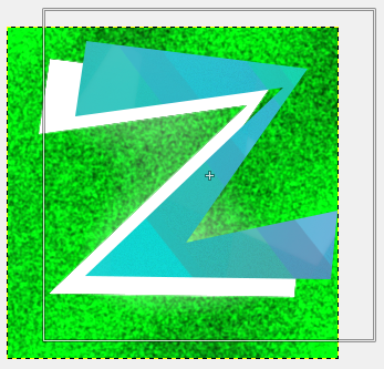 Result of texturing white Z shape with a blue ice-like texture. This is a picture of the image right before selecting the texture layer and merging downward. The texture is offset from the white Z shape for demonstration purposes only. So, those are three ways how you can texture your objects. But wait, there's more!!! In addition to special paintbrushes or airbrushes, textured fill, and my slightly confusing method above, there are also tons of effects that you can apply to add a epic finish to your images! My three favorite are listed below. Gaussian Blur... then Unsharp Mask: This has got to be my favorite. Applying a blur to an object then sharpening it just seems to add a cool glowing effect. I'm not going to walk you through it, but you can find the two filters via filters>blur>gaussian blur and filters>enhance>unsharp mask. 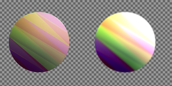 Left: control sphere. Right: sphere with gaussian blur and unsharp mask applied. HSV Noise: This is one of those effects I commonly use for the graphics on this site. It gives a good gritty texture if I want one, or I sometimes just use it for shading. Either way it's pretty useful. You can find it by filters>noise>hsv noise. 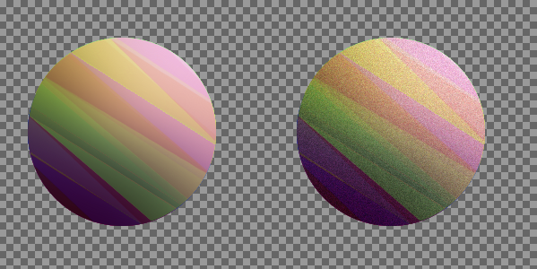 Left: control sphere. Right: sphere with hsv noise applied. Supernova: Sometimes the best way to texture something is to add a cool lighting effect. Luckily, GIMP has a really good one, and you can find it under filters>light and shadow>supernova. This gives a bright lighting effect that looks like a star going supernova which can be customized to your liking. I usually like putting the center of the nova slightly off the screen and putting the spokes and radius variable rather high so that my object only catches the rays of the nova. 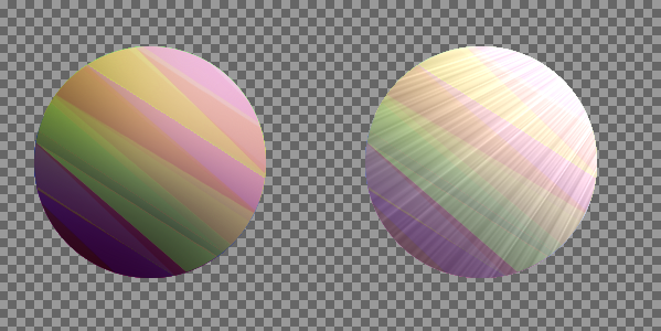 Left: control sphere. Right: sphere with supernova. I selected only the sphere so that the rays would not extend past its border, and I put a white supernova just past the top right corner. |
10: Gimp Can Animate Gif Images |
| I'm sure you've seen plenty of animated icons all over the web. So how do people make them? Well, one way is by using a service such as gif-maker, but when you do that you get an advertisement for it in the corner of your animation. Luckily, from now on, you can make them with GIMP! I'll show you how. First, make a new GIMP image with file>new. Make sure not to make the image too big, 200 by 200 is probably the highest resolution you want. Any bigger and your GIF file will be awfully large in the end. The first thing you want to do is not to click layer>new layer. If you do that, the first frame of your animation will end up being that white background, and you don't want that! Unless maybe you do, but anyway... When you're making a GIF, you never want to add excess layers. Despite how I said in this blog post to keep separate elements of your image on separate layers, you never want to do that with a GIF image! Instead, every frame will be on its own layer. Why? Well when you make a GIF with GIMP, one layer is one frame. Along the way as you're making your animation, if you ever want to see what it looks like so far, click filters>animation>playback. Once you've finished all of the frames of your animation, simply click file>export and name your file "[FILENAME].gif". You'll want to check the box that says "as animation", and you also probably want to check the box that says "use delay entered above for all frames". Change a few settings if you want, then click OK and you're done! |
Conclusion |
| Well, I hope you enjoyed this blog post! If you have any questions or comments, leave a comment below! If you think I could improve something, leave a comment below! If you think this article was no good, poorly written, and needs to be chopped into a billion pieces, please do not leave a comment. Thanks! xD If you appreciate the time and effort I put into this site, please consider subscribing to the RSS feed (at the top of the page) and/or supporting me and my site by donating a small amount. Thanks again! Have a great day! -Superdoggy |
 RSS Feed
